JSTOR Daily:
Optimizing content discoverability for intellectual readers
Overview
How can we best help readers find useful and interesting content on JSTOR Daily?
JSTOR Daily is a free online publication operated by JSTOR, a digital library, that aims to bring insights from academic research to both scholarly and general audiences.
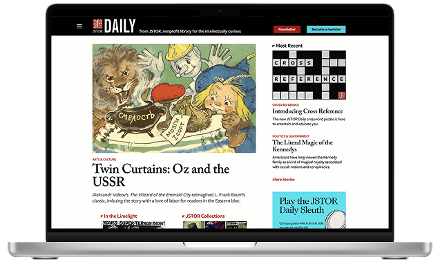
JSTOR Daily's original homepage.
Due to the unorganized structure of the website and inefficient search functionality, key users face significant challenges with navigation and content discoverability.
Academic readers, such as educators, struggle to locate relevant articles, and casual readers are overwhelmed by the large catalog, leading to lower retention rates and underutilized content.
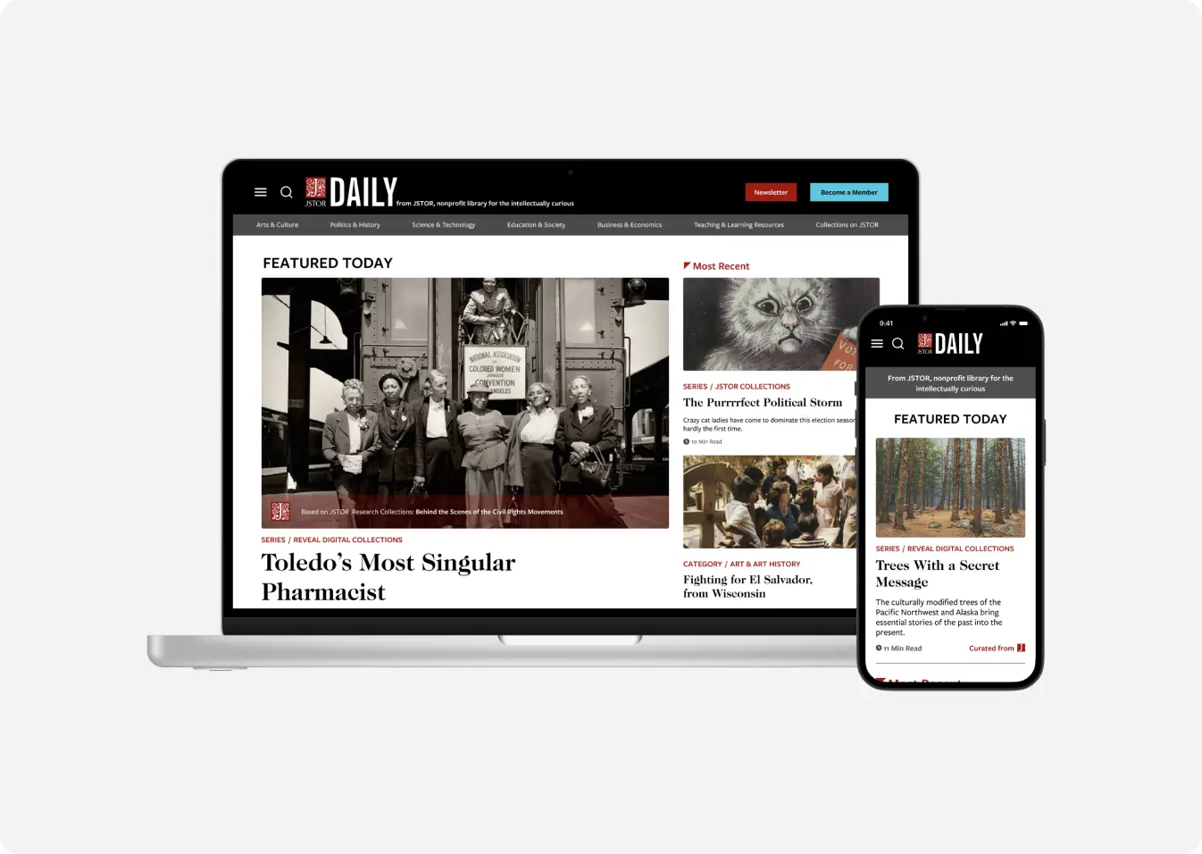
80% faster efficiency finding content readers like. Our redesign achieved an overall 80% faster efficiency in tasks regarding content discovery, navigation, retention methods, and the strategic use of visual elements.
Project objectives and goals
Working with the JSTOR Daily team, we had the following goals for improving the publication website:
How do users currently navigate JSTOR Daily's website?
What factors influence user satisfaction and likelihood of returning to JSTOR Daily?
How effective is the current search functionality in helping users find relevant content?
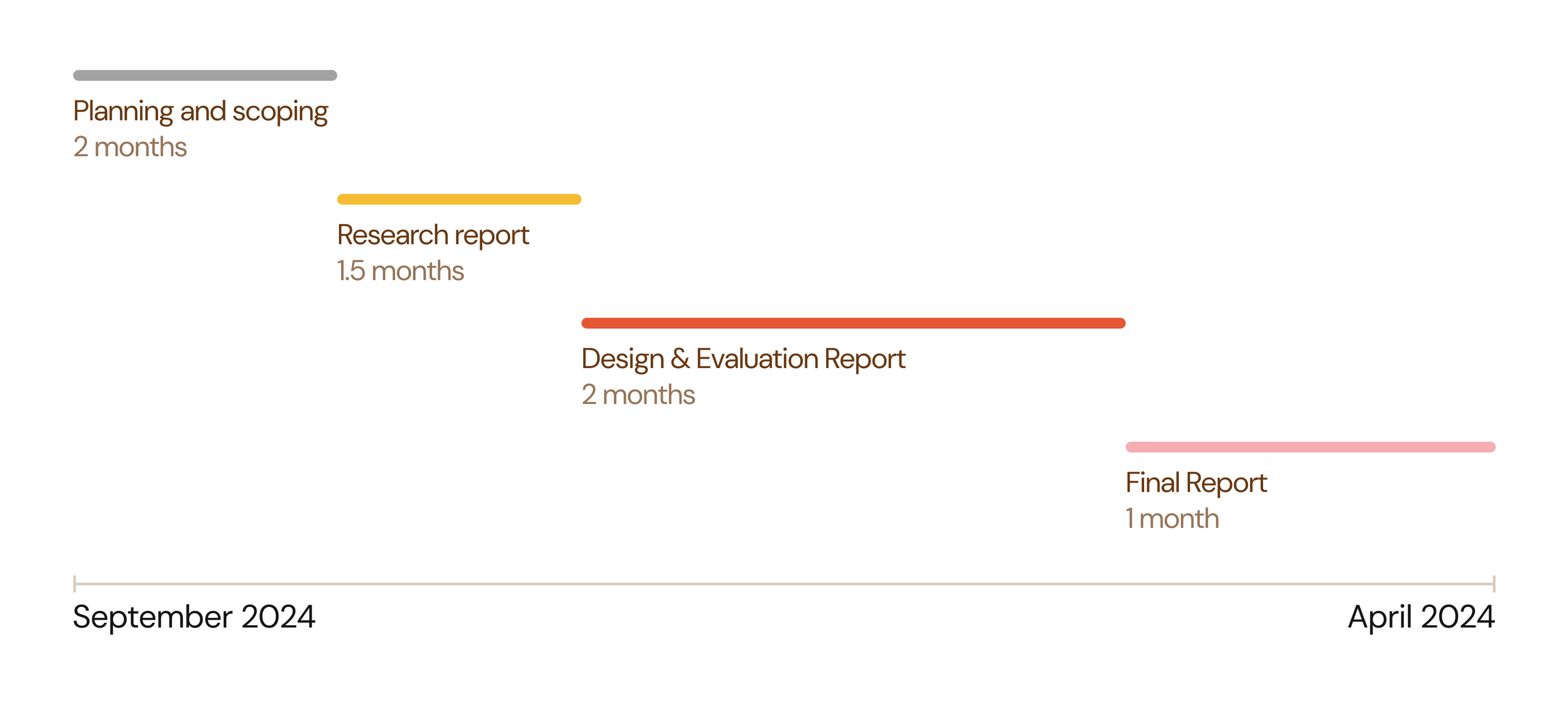
We created a timeline to convey to the JSTOR Daily team when we would provide certain deliverables, and to keep ourselves accountable throughout the project as well.
Six research methods to evaluate user experiences and functionality
To get a full picture of the current situation with JSTOR Daily, we engaged with a diverse set of 6 methods.

- Surveys and interviews: Understanding readers' desires and pain points
- Accessibility Audit: Making sure the site is accessible to all kinds of readers
- Google Analytics: Seeing what content attracts the most clicks and screentime
- Competitive Analysis: Seeing how other digital publication sites approach navigation, layout, etc.
- Usability Tests: Testing the original website to pinpoint specific opportunities for improvement, and testing the prototype as we develop it to refine it
Research findings
I will only be discussing the findings of a select few research methods in consideration of the length of this case study, but a full discussion of results can be found in our final report, which is accessible at the bottom of this page.
Surveys: What people desire and what we can emphasize
We sent out our survey to the JSTOR Daily newsletter, and used affinity mapping to analyze 243 survey responses from both readers and non-readers. We gauged what people desired more from the JSTOR Daily website, and what they liked about the website that we could place more weight on.
- Content for educational purposes
- Interaction with text/content
- Sharing of articles via link is preferred
- Relevance of recommendations/categories
- Personalization to interests
- Opportunities to explore JSTOR content
- Visibility of references to establish credibility to readers
- Article cover pictures influence readers to click on articles
- People enjoy finding "gems" of stories and information
- Diversity of articles is a strong suit
Competitive analysis: Drawing inspiration from competitors
We observed and noted how successful competitors, some of which were mentioned by research participants, organized their content and layout.

For example, we analyzed what worked about Aeon's navigation menu:
- ⭐ Large titles for categories
- ⭐ No more than 7 categories (5 plus or minus 2 is the best for cognitive load)
- ⭐ Differentiate between larger categories with color, location, and font size
Analyzing what worked about competitors' choices would help inform our own design, drawing inspiration from best practices.
User journey: Seeing through users' POVs
Across 10 interview participants, we noticed two common groups of users that we could target in our improvements: educators and casual readers.
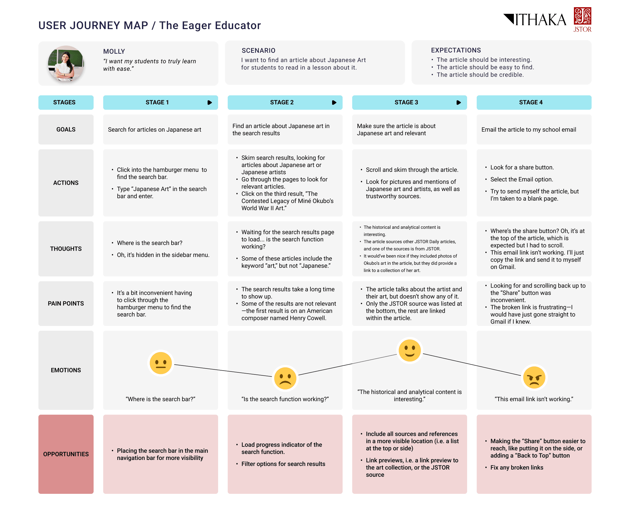
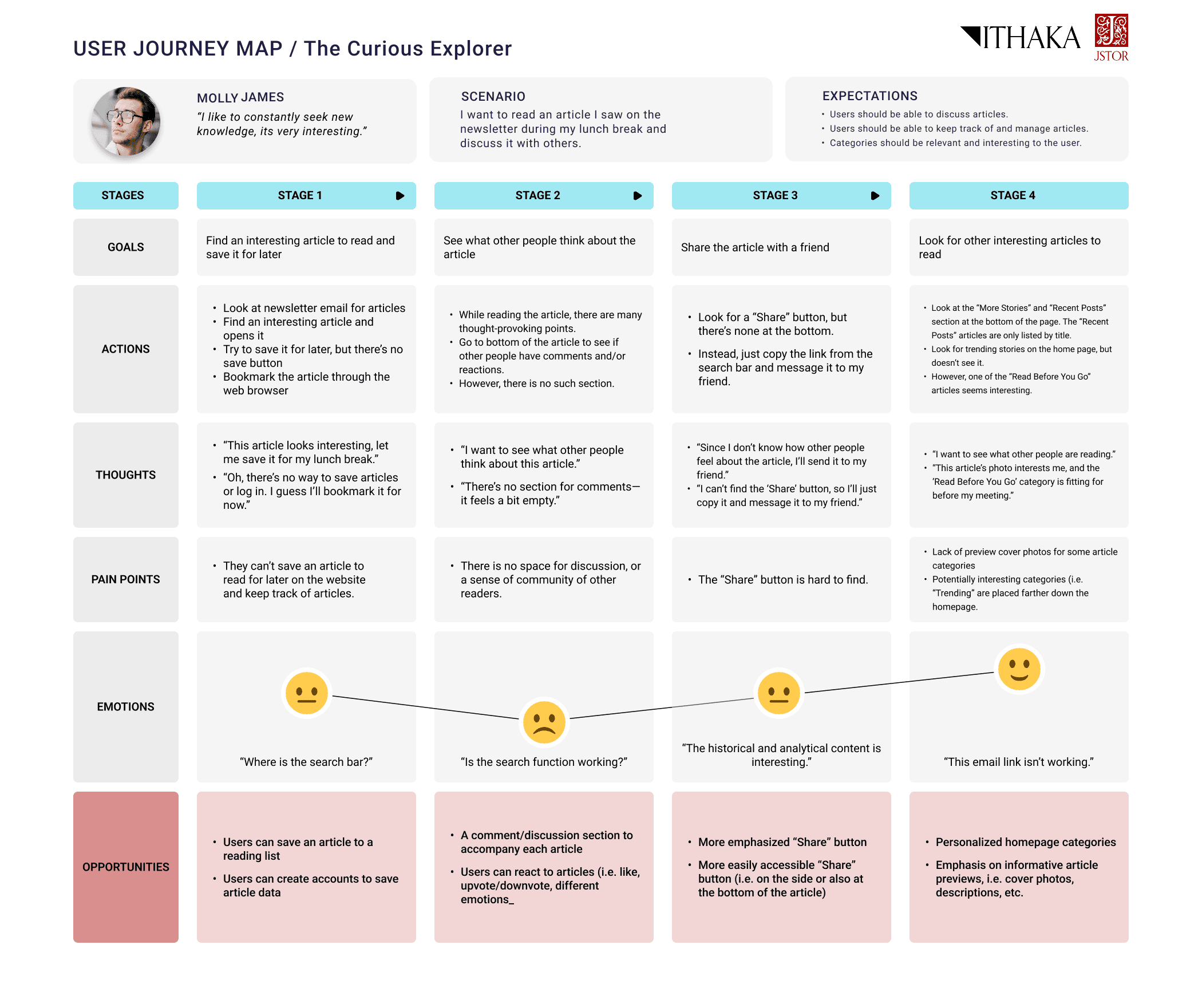
In addition to personas, we created a user journey map to walk through a specific scenario for each user group from their perspective. This helped us pinpoint specific opportunities for improvement.
We talked to several educators who enjoy JSTOR Daily's content and want to incorporate it in their lessons.
Our main question: How can we help them find content for their students and emphasize teaching resources?
We also talked to many casual readers who enjoy the intellectual nature of JSTOR Daily's articles and read them in the pursuit of more knowledge.
Our main question: How can we help them find diverse content that interests them and improve engagement with JSTOR Daily?
Usability tests: Uncovering usability issues
We provided tasks to familiar and non-familiar users testing the following:
- 🎯 Navigation
- 🎯 Search function
- 🎯 Relevance of content categories
- 🎯 Newsletter subscription (evaluating specific retention methods)
This revealed the following specific usability issues:
- Search results were not relevant to what users were looking for
- Unintuitive location for the search bar
- Unclear language that confuses users (e.g. collections vs. series)
- Newsletter signup is memorable
Turning user insights into ideas
Design requirements: From research to tangible features
With the sheer amount of information we gained from our many research methods, we had to hone in on what would be most important and impactful to users.
We created a table of features informed by research insights to evaluate and compare the features in how much they would improve user experience. We used this table to decide what to focus on in our prototype, while leaving the rest as a future reference for the JSTOR Daily team.
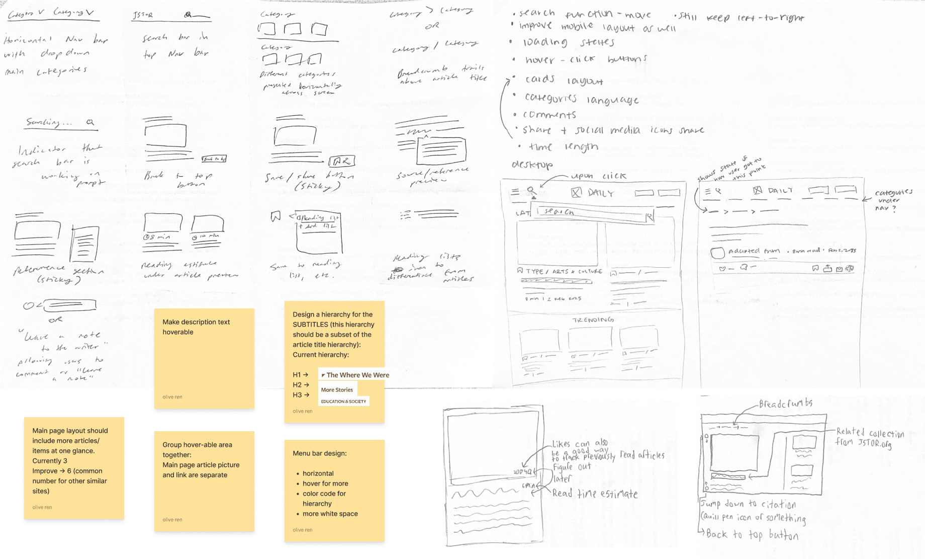
Our rapid ideation session—what features would be most helpful to users based on our research insights?
Low fidelity wireframes: Developing and testing functionality
We focused on redesigning three main components:
- ⭐ Homepage
- ⭐ Navigation bar
- ⭐ Article page
We started out with low-fidelity wireframes to firstly focus on functionality and layout. This initial draft proved useful as we were able to obtain user testing feedback on these early stage ideas, easily adjusting and iterating as we continued to design.

For example, the mobile article menu was adjusted based on the following feedback:
- Feasibility: JSTOR Daily could not implement an account system to allow users to save articles.
- Accessibility: The menu was moved to the bottom of the screen for more convenient access.
Key design elements
Our final design was informed by both user feedback and needs, as well as JSTOR Daily's business goals. After multiple cycles of feedback with the JSTOR Daily development and editing team, and various types of users, we developed the final redesign with the following themes:
Improved layout to clearly display JSTOR Daily's diversity of content
Emphasis on JSTOR Daily's special categories, such as educational resources and JSTOR collections
Clarified navigation menu with more distinction between categories
Use of images to draw attention to specific content and newsletter signup
Making actions more visible through language and visual elements (e.g. share article)
We saw significant improvements in task completion time (i.e. sharing articles, finding topic-specific content) on our prototype compared to the original website. Four out of five tasks had at least an 80% increase in task efficiency.
Below is a more detailed explanation of what we changed and why in the three main components: the home page, navigation bar, and article page.
Home page

Navigation bar

Article page

Handing it off
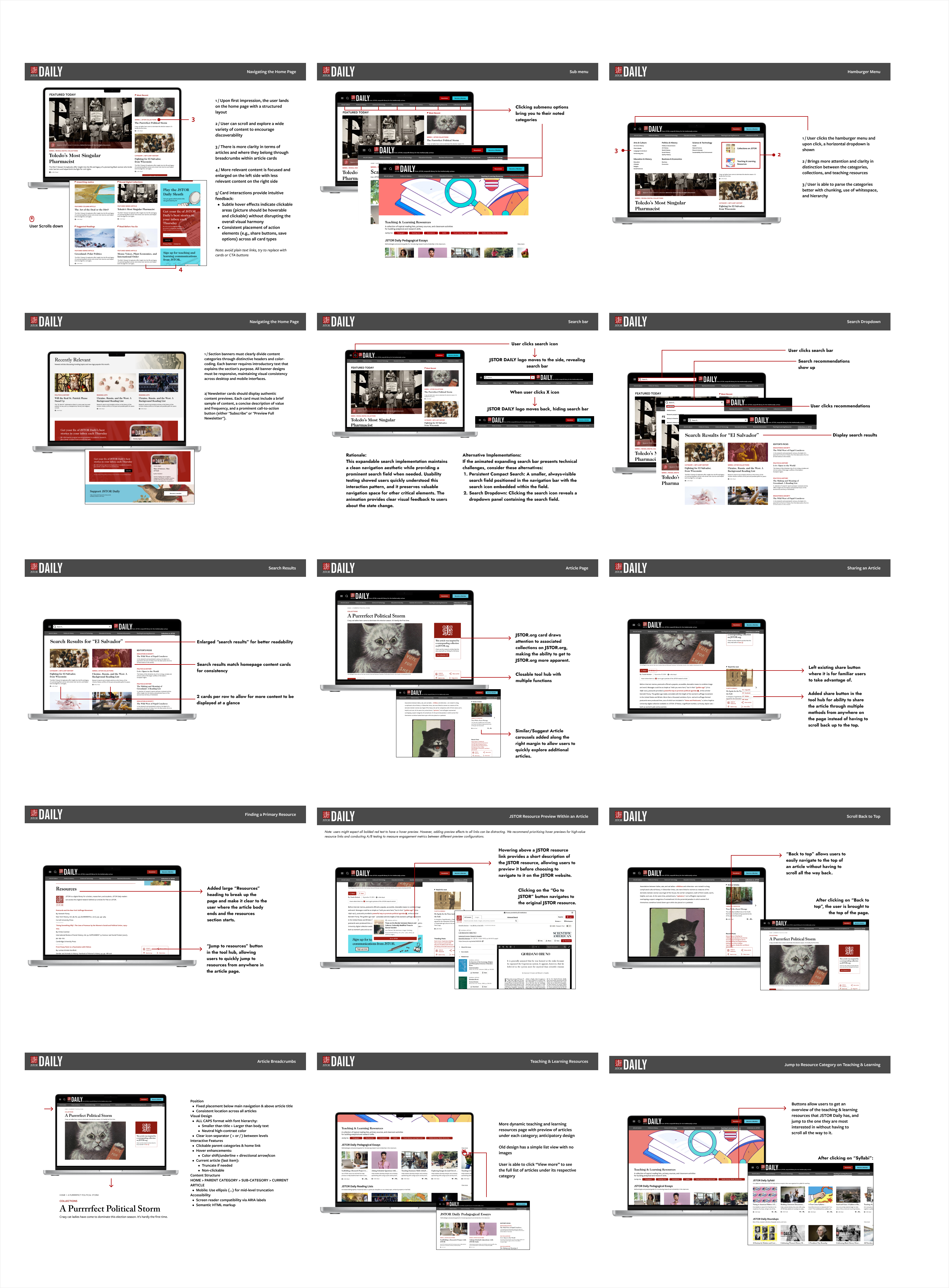
To allow the JSTOR Daily team to easily reference our recommendations and findings after the end of this project, we created handoff documents so they could more easily implement our design as we intended.
User flow
Maps out each interaction and the paths a user can take within the redesign.

UX Specification
Clearly defines layout, interactions, and behaviors of the redesigned user interface for developers.
Reflections and next steps
This project could only be so fulfilling because of the people I worked with—my teammates with their collaborative, dedicated, and creative spirit, and the JSTOR Daily team for their helpful feedback, support, and direction. I will not forget the late night work sessions with the team and Google Meet calls where JR's cat would say hello!
I learned a lot from the nature of the project—since it was client-based, consistent communication, emphasis on business goals, and evaluation of feasibility was necessary for the project's success. The sheer amount of user feedback and engagement during the project was amazing. I met all kinds of readers, and was inspired by their dedication to knowledge. It was fulfilling to hear the many different ways of what JSTOR Daily meant to them.
Moving forward, I would like to improve on one aspect:
- Design systems: Although we created a dedicated asset system used throughout the redesign, I would like to further explore creating a more structured and granular design system to allow for streamlined designing.
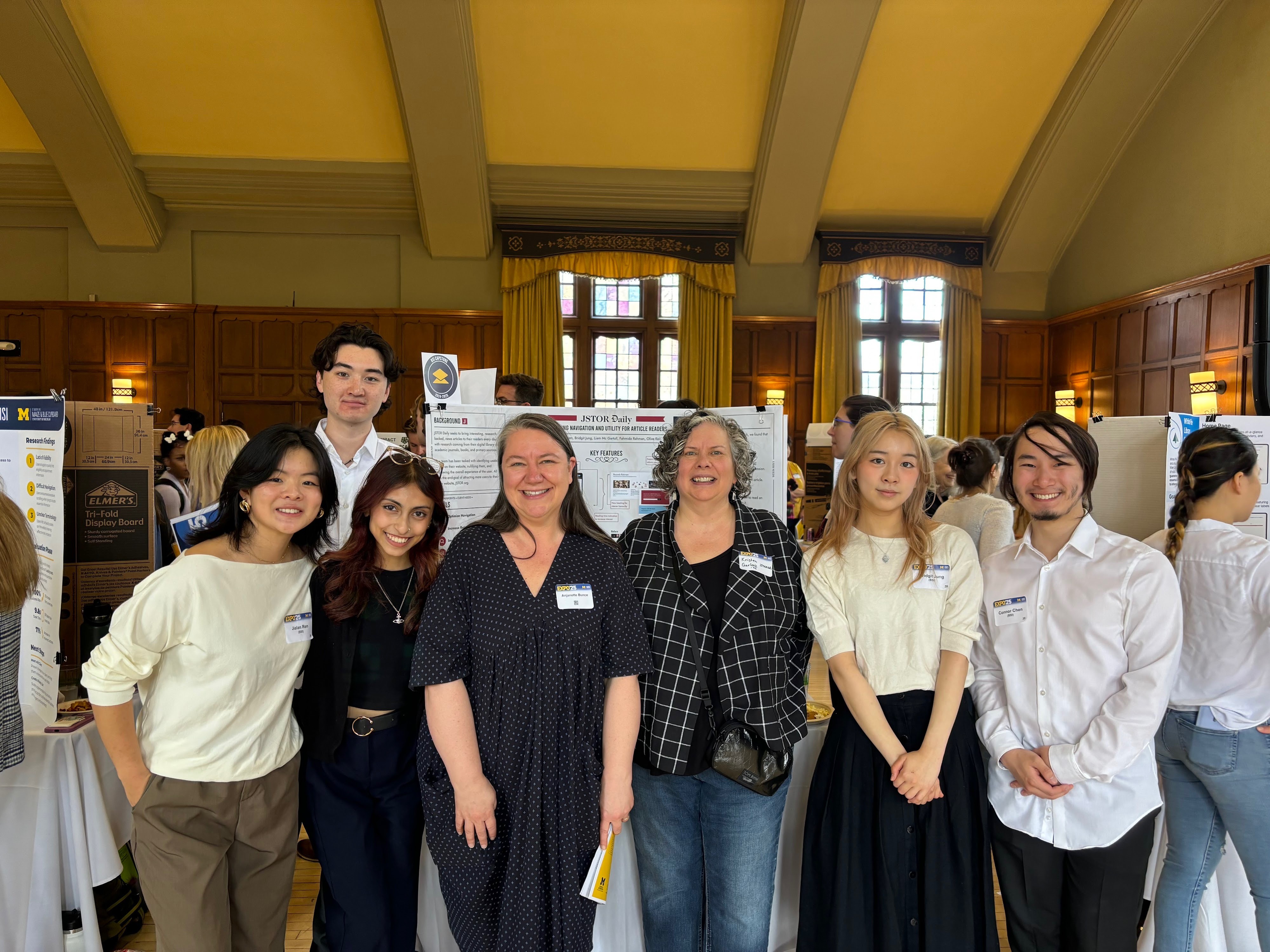
Thanks to my teammates—Olive, Liam, Mida, and Connor—and the JSTOR Daily team—JR, Johnathan, and Anjanette—for making this such an amazing experience!
Final prototype
Try out our interactive prototypes of the JSTOR Daily redesign! Check out our final project report and UMSI expo poster as well.
Desktop
Mobile
Thank you for reading! If you have any questions about this project, feel free to email me at bridgit.jung@gmail.com! ✶⋆.˚